Business Card Design Tips
Here are some practical tips to help you create professional, print-ready business cards that look great and communicate your information clearly.
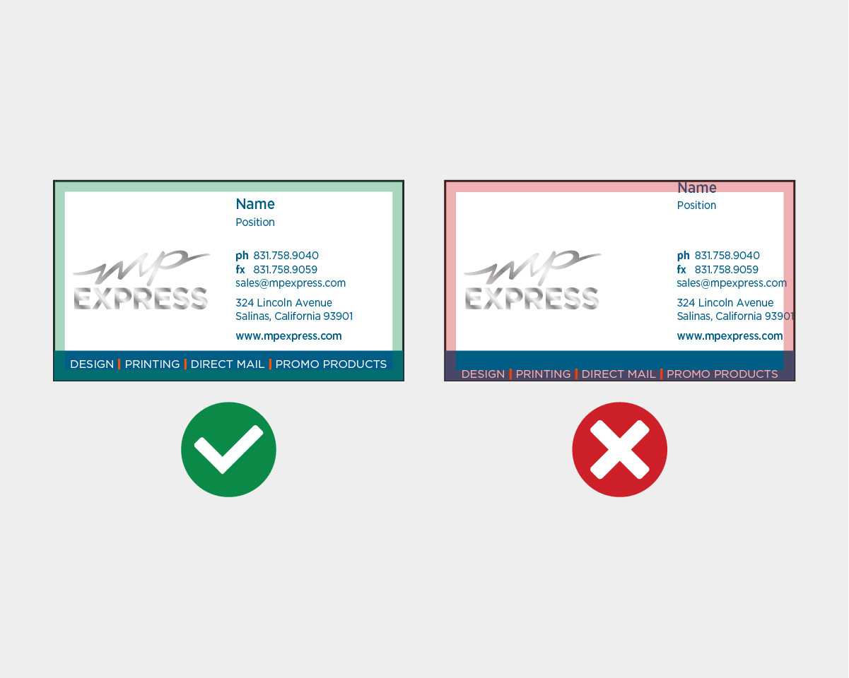
Avoid Using Borders
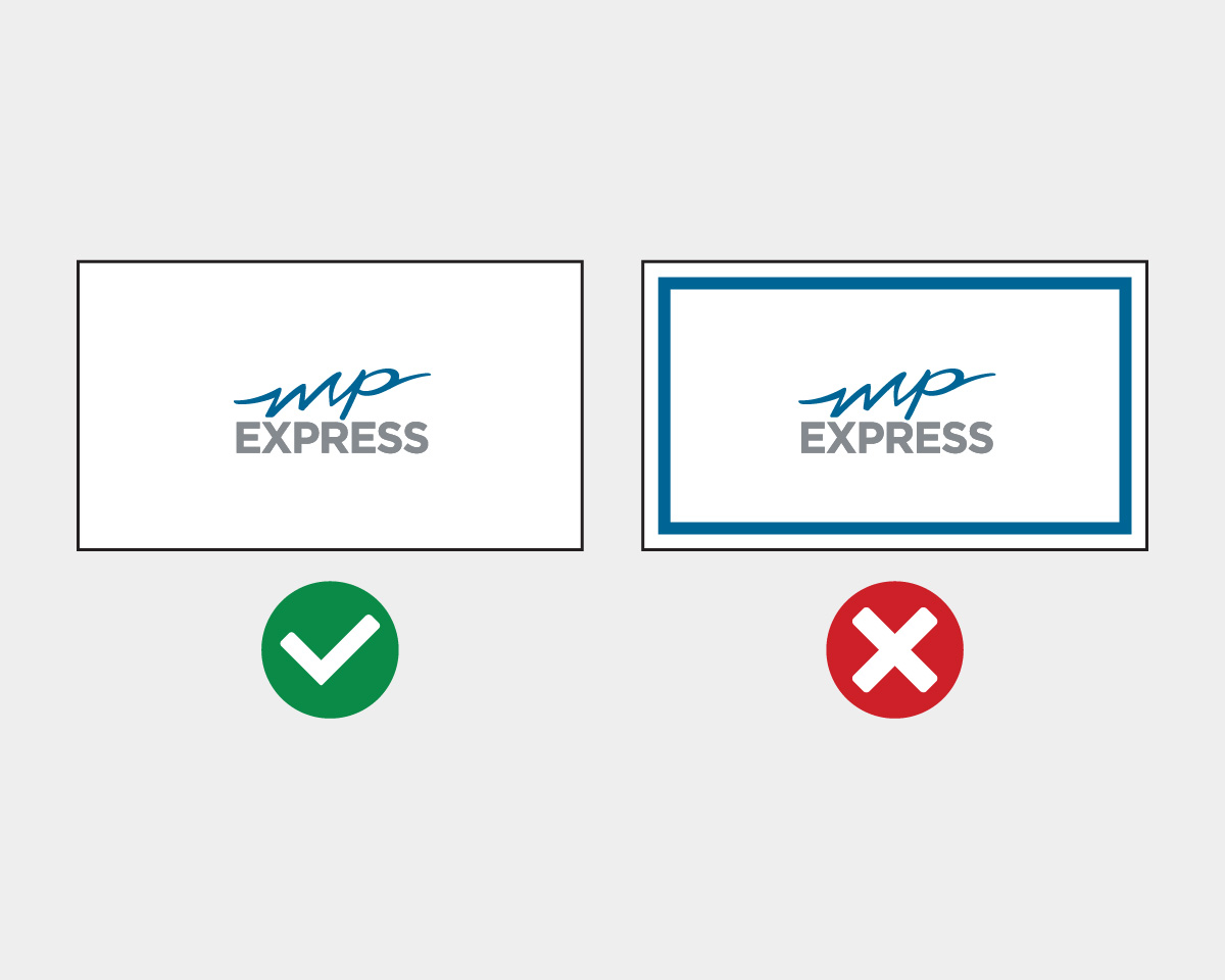
Using decorative borders in your design may seem appealing on a screen, but when cards are printed and trimmed, slight cutting shifts can make borders appear uneven or off-center. For a cleaner, more reliable final result, it’s best to design without borders.
Prioritize Legible Text
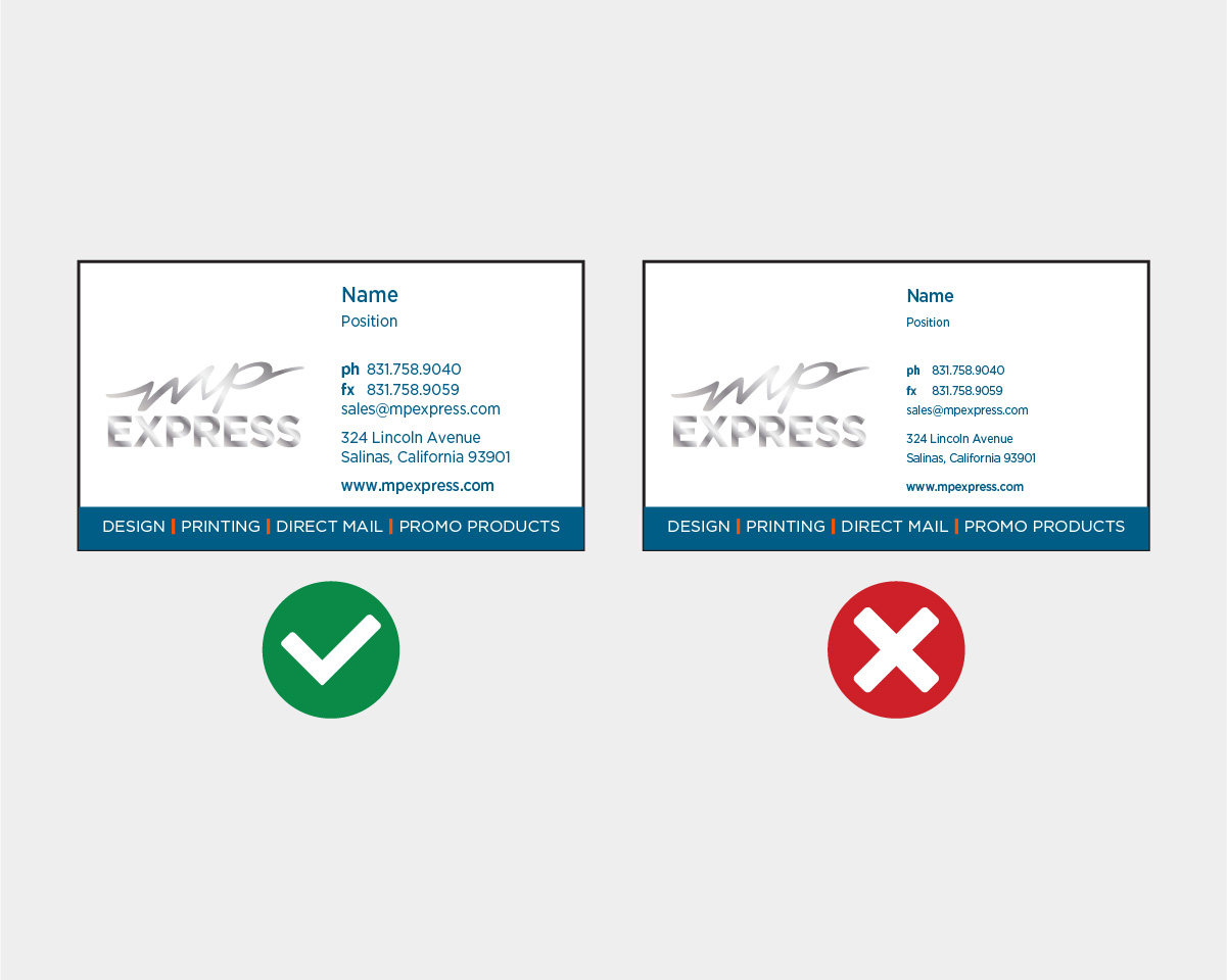
Readability is crucial for business cards. If the text is too small, recipients might struggle to read essential details once the card is printed. A practical rule of thumb is to use a font size that’s easy to see — avoid going below about 7 pt — so your name, title, and contact information remain clear.
Maintain Safe Margins
Make sure there’s adequate space between your content and the edge of the card. Leave at least about 1/8 inch of margin on all sides to reduce the risk that important text or design elements are accidentally cut off during printing and finishing.