CMYK vs RGB Explained

RGB is for screens, CMYK is for print, and they produce color differently—read more for printing best practices.
Understanding Color Models: RGB vs. CMYK
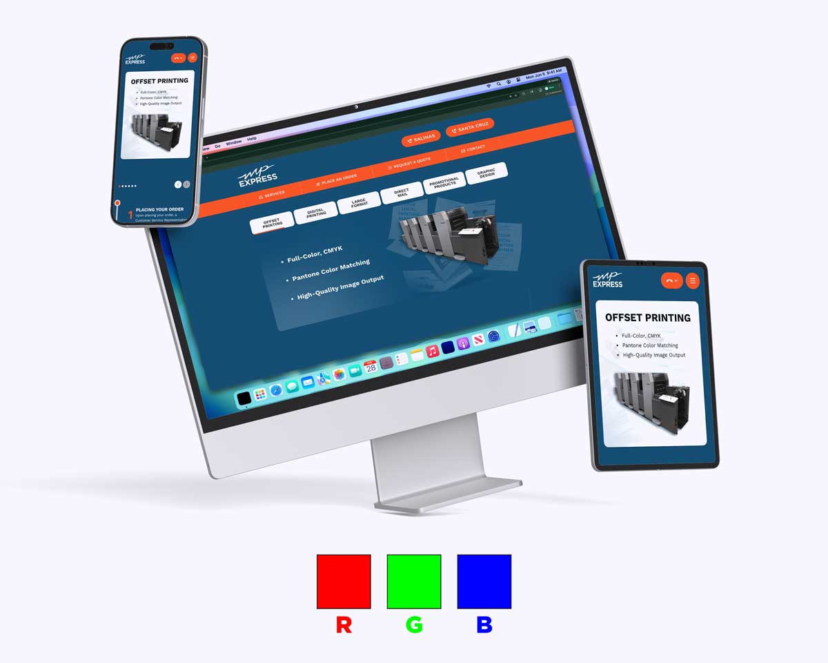
When you create designs digitally — such as graphics for a website or social media — you’re typically working in RGB color mode, which stands for Red, Green, and Blue. RGB is an additive color system: colors are made by combining light, and when all three components are at full intensity, the result is white.
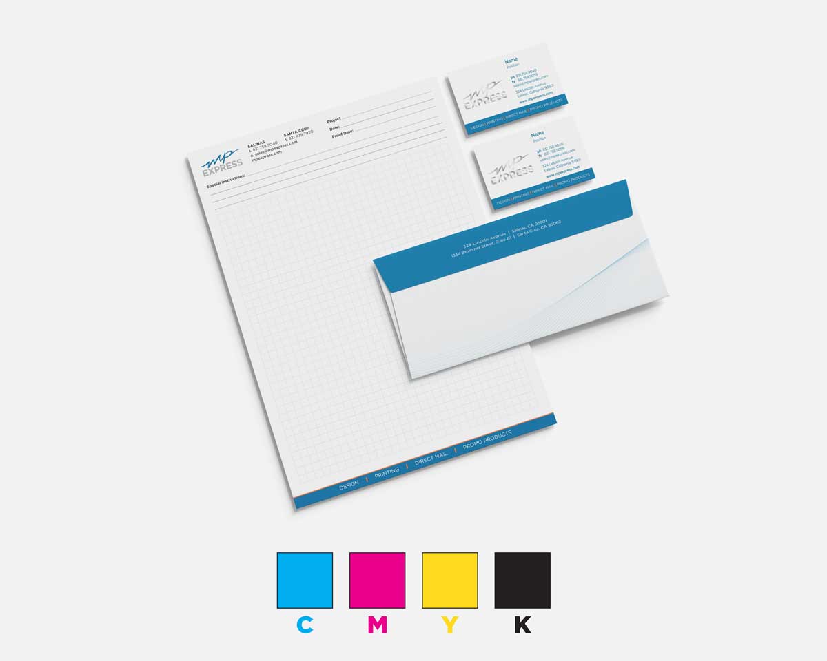
In contrast, CMYK stands for Cyan, Magenta, Yellow, and Key (black). It’s a subtractive color model used in printing. Instead of creating light, CMYK inks absorb portions of white light that hits the paper. As more ink is applied, less light is reflected back, creating darker tones and subtle shades. This is how printing presses reproduce a wide range of colors with ink.
Why Print Uses CMYK Instead of RGB
Printers rely on CMYK because physical inks behave differently than light-emitting pixels. RGB’s range of colors (its gamut) is much broader than what ink can reproduce. Some bright digital colors — especially vivid blues, greens, and reds — simply cannot be matched exactly with ink on paper.
When RGB designs are sent to print as-is, most print workflows automatically convert them to CMYK. Because the two systems don’t share the same color range, this conversion often results in muted or shifted hues compared to what you see on screen. For vibrant, accurate printed color, preparing your artwork in CMYK from the start gives you much better control over the final result.
Best Practices for Preparing Files for Print

To avoid unexpected color issues:
- Design or convert your files to CMYK before sending them for printing. This helps ensure the colors you see on screen are closer to what comes off the press.
- Be mindful of your color gamut: Some RGB colors will still appear less intense in print, so adjust designs within CMYK to get the look you want.
- Proof your files: If possible, review a printed proof to make sure saturated tones and critical brand colors are represented accurately.